Spoked is a smart cycling coach offering personalised training plans. To meet revenue targets, I was tasked with redesigning the mobile app to lower the barrier for beginners and increase new user retention.The existing app’s complexity made it difficult for newcomers to engage. After conducting user research, I simplified the content and interface to create a more intuitive experience, making the app accessible for novices while still engaging for advanced cyclists.

As this project was directly linked to a key business goal, I needed to fully understand the project purpose and the criteria for success before starting any research or design work. Spoked aimed to increase the percentage of new users and improve retention.
I conducted a user research session to observe how users interact with the current product and how it fits into their training sessions and daily routines. From this study we discovered the following insights:

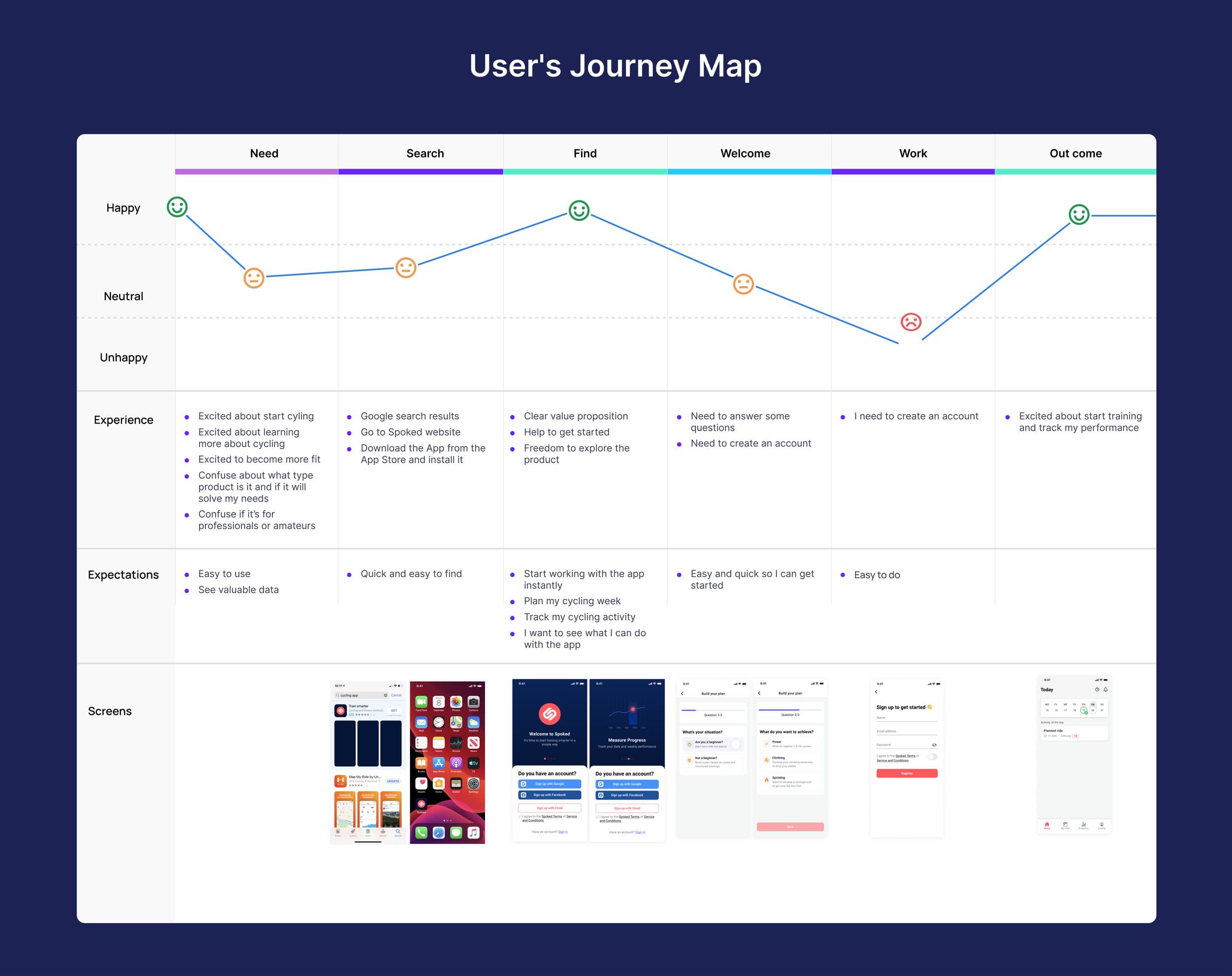
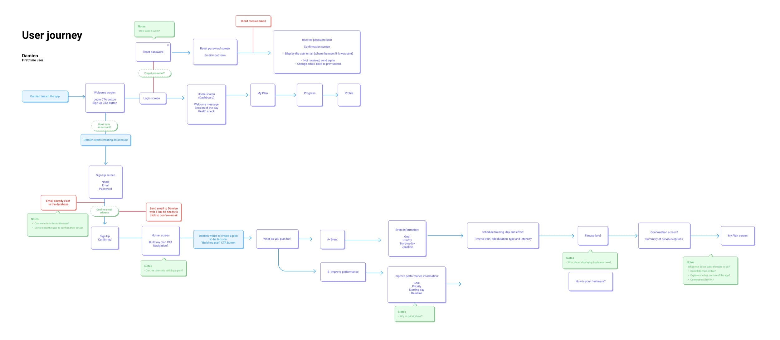
The solution design process for Spoked involved extensive iteration and user testing. I initially created a detailed user journey map to outline key touchpoints and interactions. This was followed by developing prototypes and exploring various approaches to personalising training plans and boosting user engagement. The challenge was to distill complex training data and features into a streamlined, intuitive experience that would be accessible for both beginners and advanced cyclists.


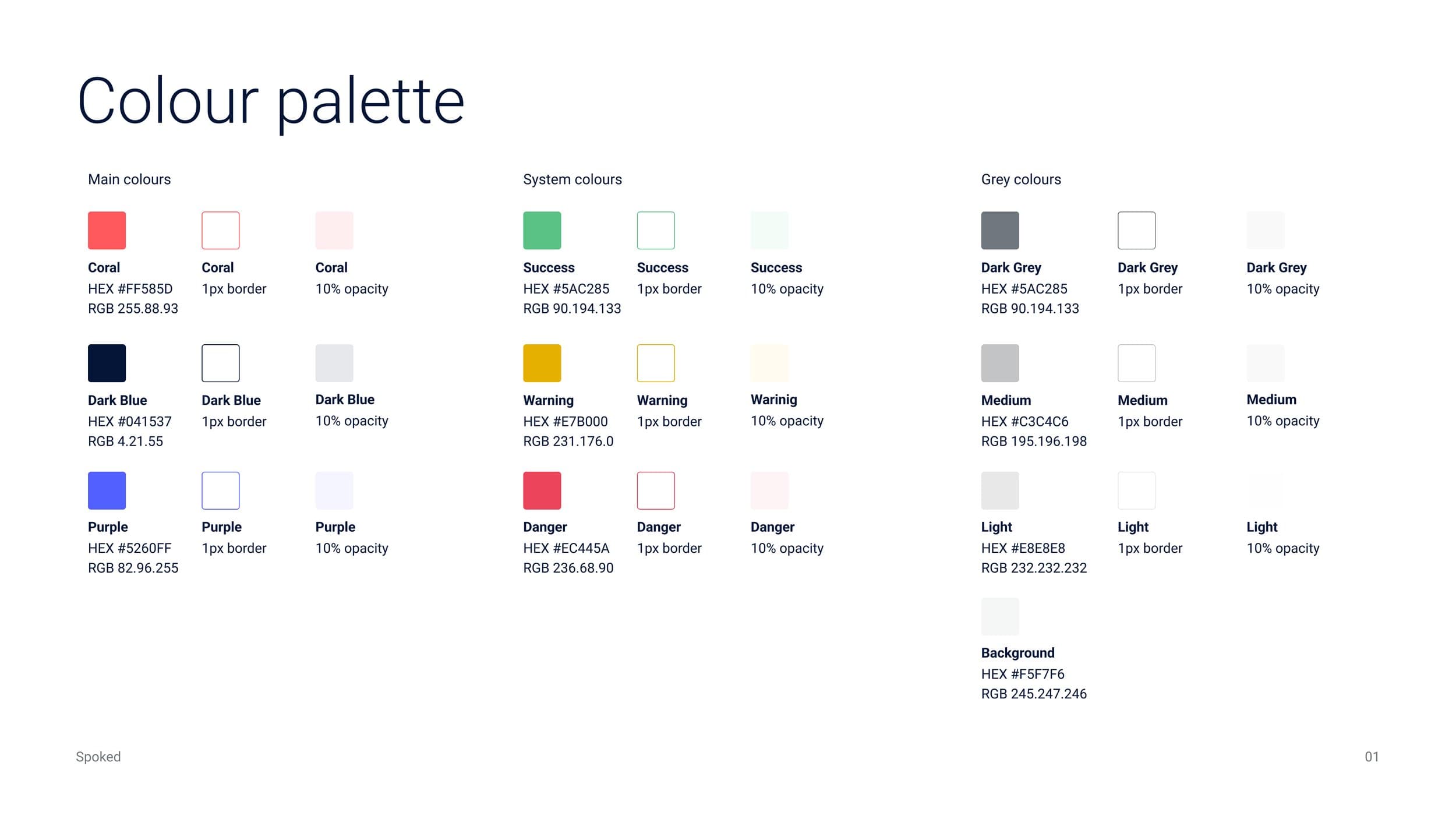
To ensure consistency and scalability across the Spoked app, I design a comprehensive design system. This system includes a carefully curated color palette, typography hierarchy, and a library of reusable components. Typography selections were made to optimize legibility for cyclists who may be viewing the app in various lighting conditions and while in motion.


Prototypes were iterated on a number of times after remote user testing sessions. Users were asked to complete a full setup journey, from selecting a training plan to finalising their preferences. We observed their interactions with the AI training plan and followed up to understand their expectations for adjustments based on their input and goals.
The final design transformed how Spoked presents training plans and user interactions. The app now provides a streamlined and intuitive setup journey with clear personalisation options and progress tracking. The design improvements simplified the user experience and addressed the complexity of adjusting training plans.
Next Project
Thank you for your interest in my work. Lets connect!
Made with tea + spicy chips. © 2024 Rosina Pissaco