
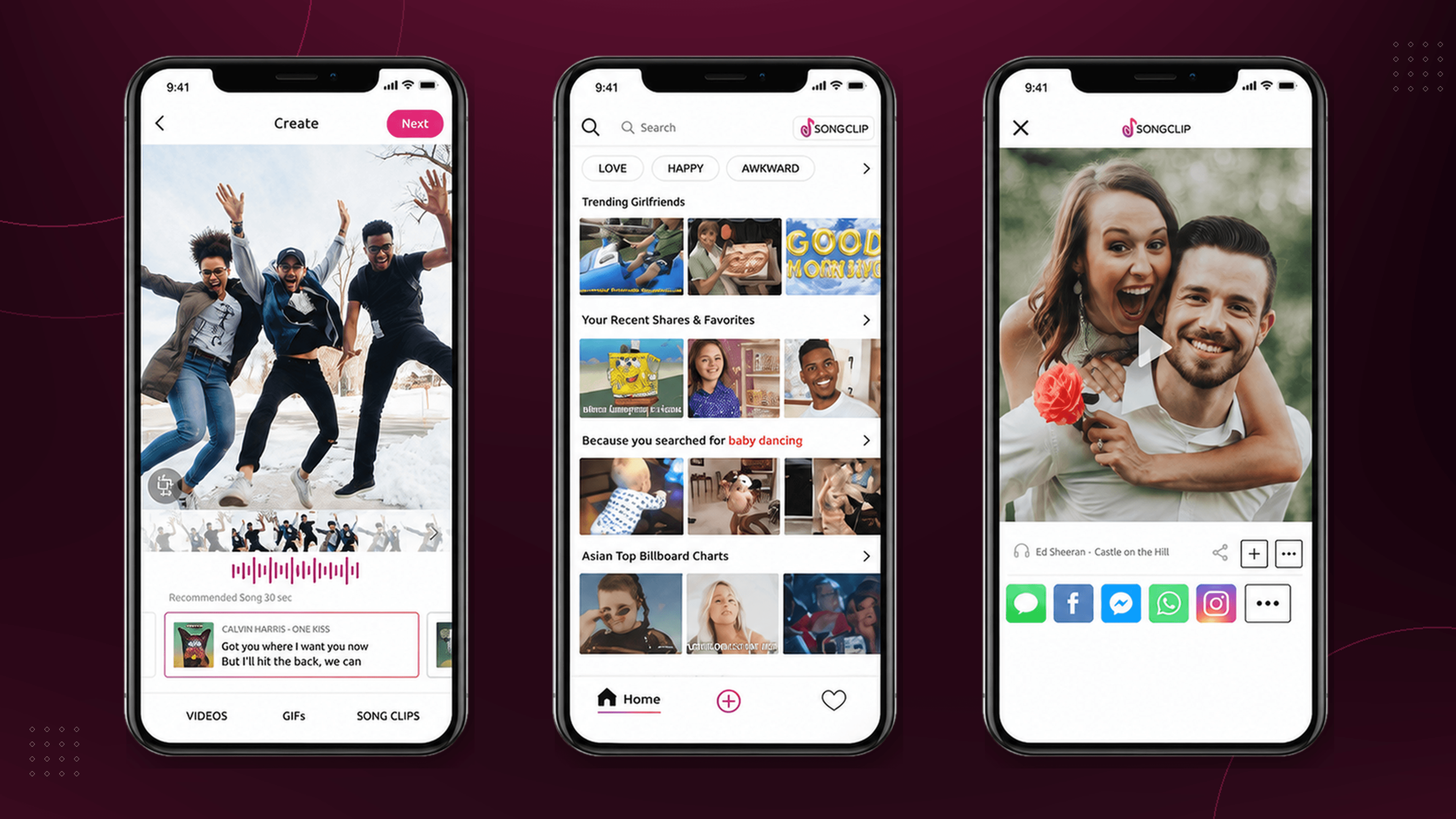
The problem
Finding the right music clip was fragmented and time-consuming.
Creators often had to leave their current task, search elsewhere, compare multiple tracks and determine whether a clip was suitable for sharing.
Songclip’s opportunity was to bring discovery, previewing and licensed sharing into one continuous experience.
Gathering insights
Two rounds of usability testing revealed two distinct ways people looked for music, and showed where the discovery experience interrupted their flow.
2 rounds
Remote usability testing
8 participants
Regularly shared music or short-form content
1 core journey
Find, preview and share a clip
01 · Discovery
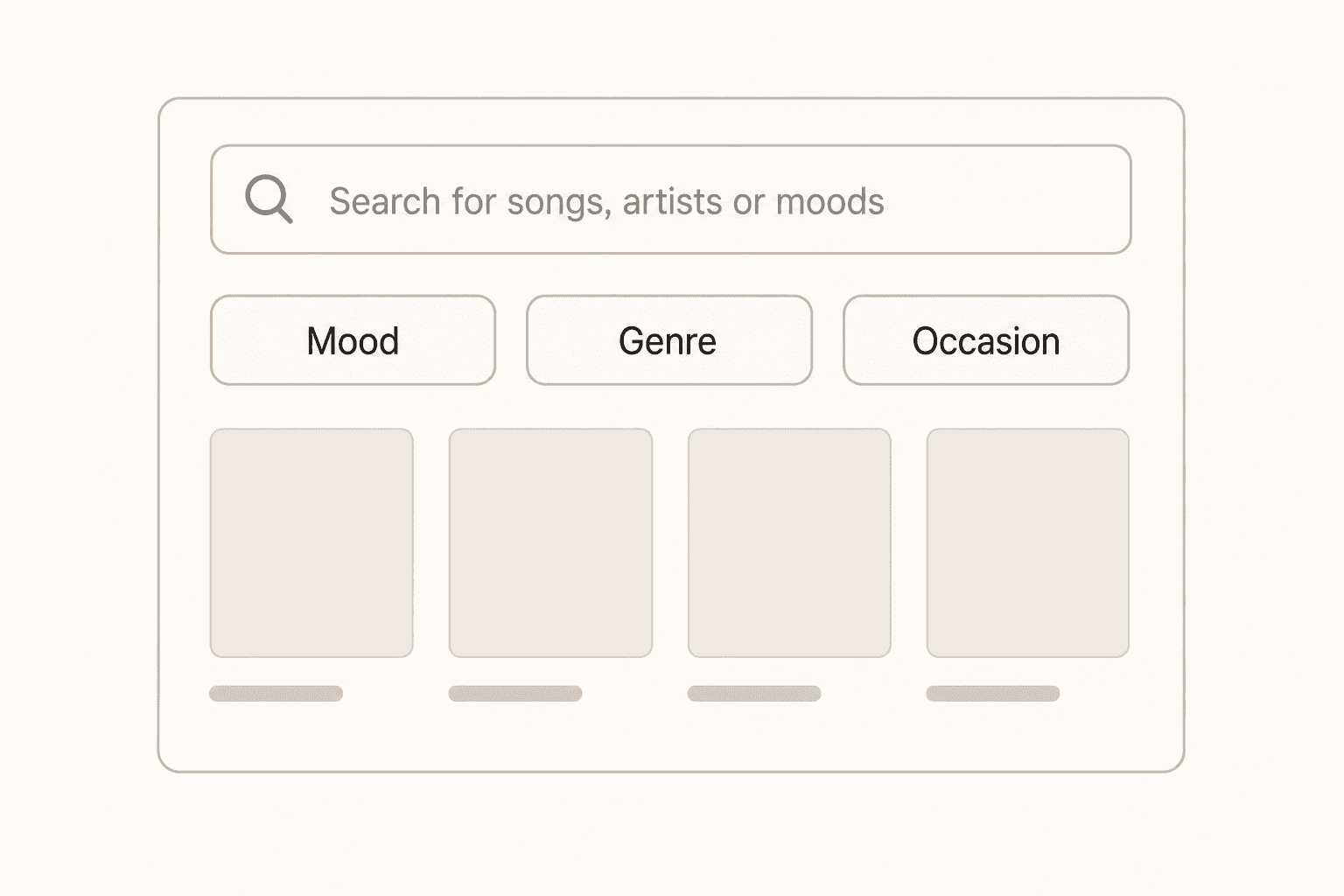
People searched with different levels of intent
Observed behaviour
Participants searched when they knew the song or artist, but browsed when they only knew the mood, occasion or feeling they wanted.

Design implication
Support known-item search and exploratory discovery within the same experience.
02 · Preview
Previewing clips interrupted discovery
Observed behaviour
Participants expected to preview clips directly from the results. Opening a separate screen made comparison slower and caused them to lose their place.
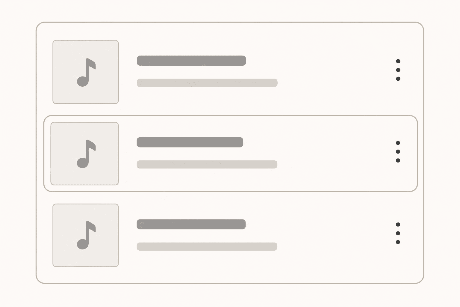
Earlier experience
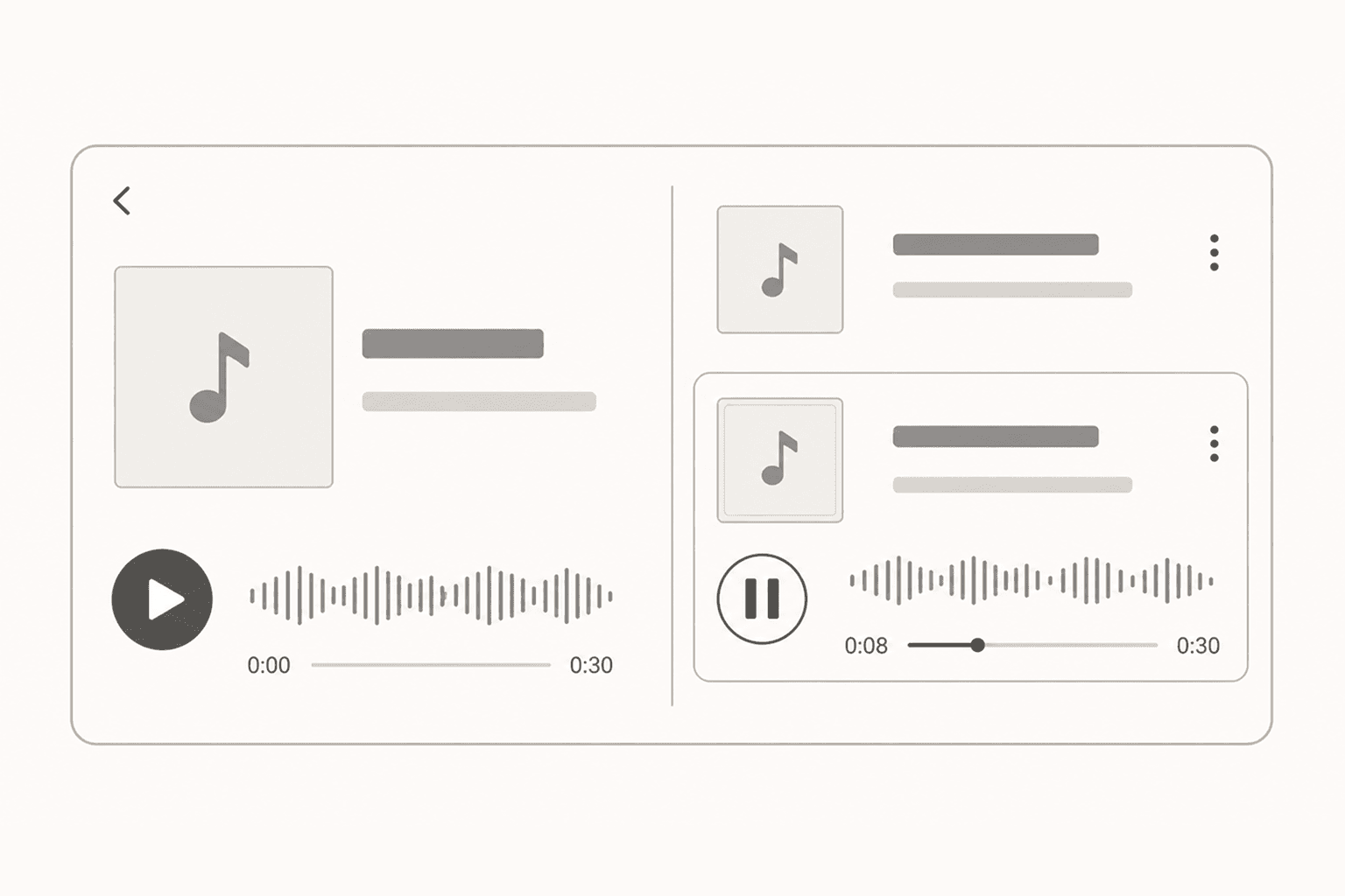
Improved concept
Design implication
Keep playback in context so users can compare clips without interrupting their browsing.
Principles that shaped the experience
Support both search and browsing
Keep previews within the discovery flow
Reduce the distance from finding to sharing
Design decisions
Supporting two discovery behaviours
The central decision was whether to prioritise search or browsing. Search is efficient when users know a title or artist, but testing showed it fails for mood-based discovery, which is how many people actually choose music. A browse-first model solved that, but slowed down users who knew what they wanted.
I chose a hybrid: prominent search supported by curated mood, genre and occasion categories, with immediate previews throughout. This supported both known-item discovery and exploration without forcing either group through the other's flow.
Wireframes
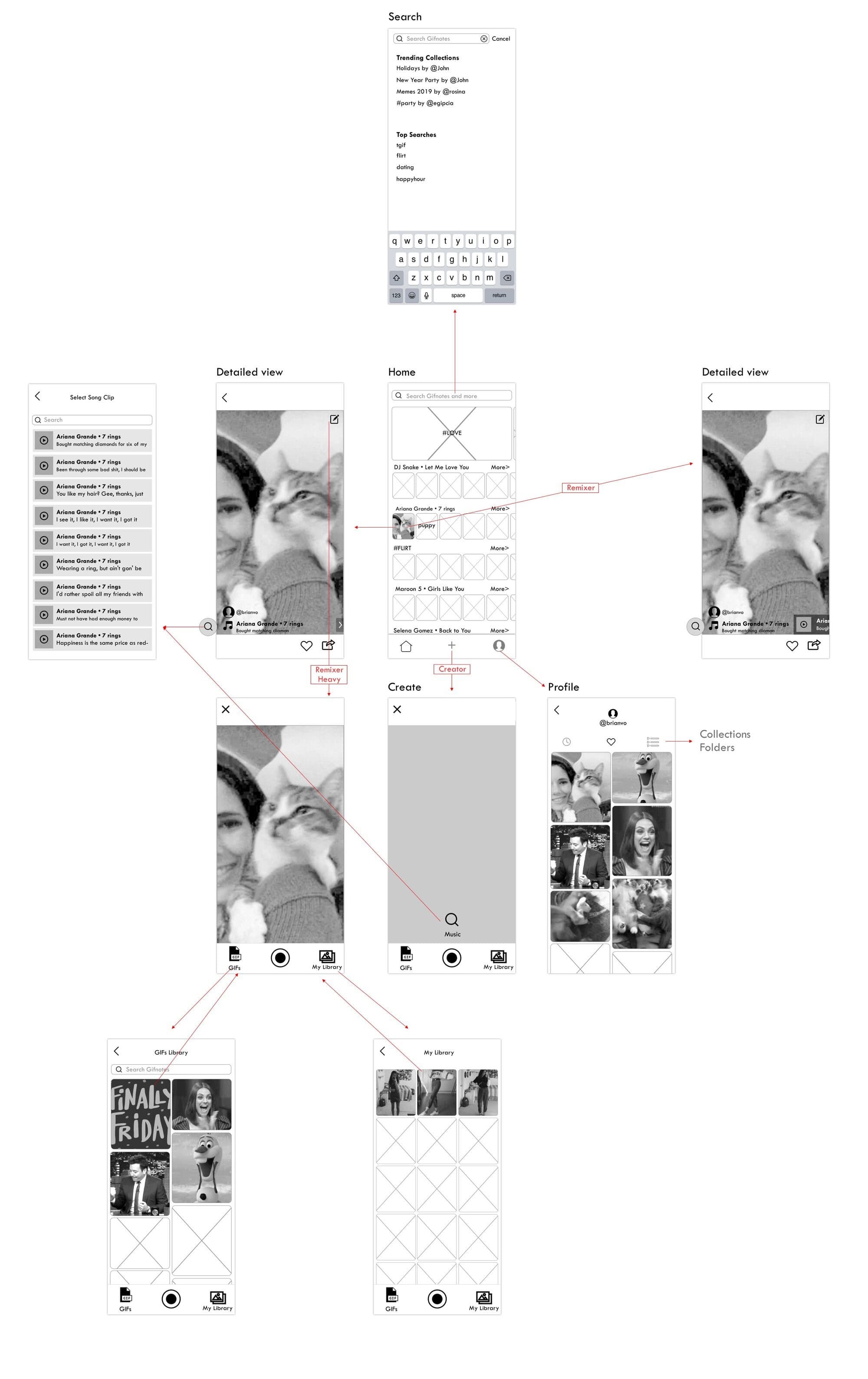
Early wireframes mapping the core flows: discovering a clip, previewing it, and sharing it across platforms.
Validating the redesign
To measure the redesign, participants completed the same task, finding, previewing and sharing a clip, in both the previous experience and the redesigned prototype. Median completion time fell by roughly 21%.
The solution
The final experience combined direct search with mood-led discovery, previews within the browsing flow and a shorter path to sharing. It supported both users who knew the track they wanted and those who needed inspiration.
The same interaction patterns were later adapted for the web app and partner integrations such as Viber.
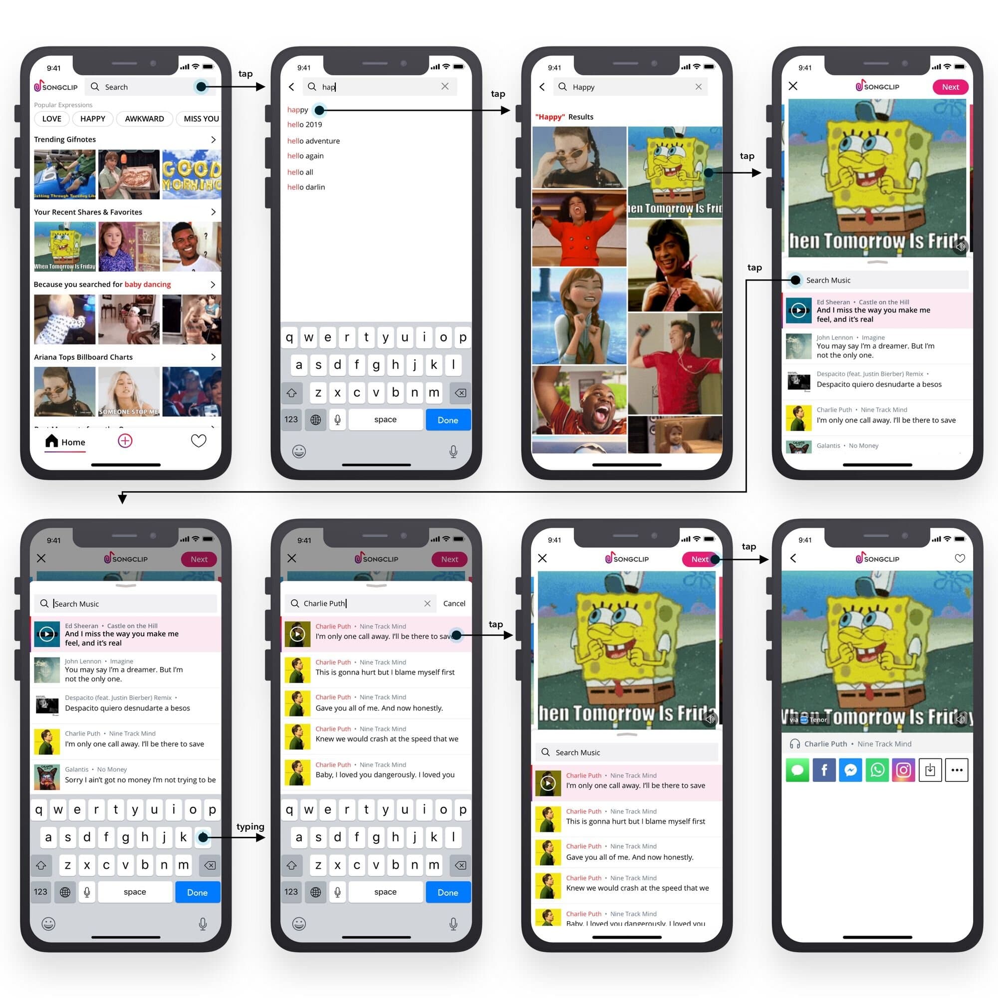
High-fidelity iOS designs
The finished iOS screens for search, clip preview, and sharing in a couple of taps.
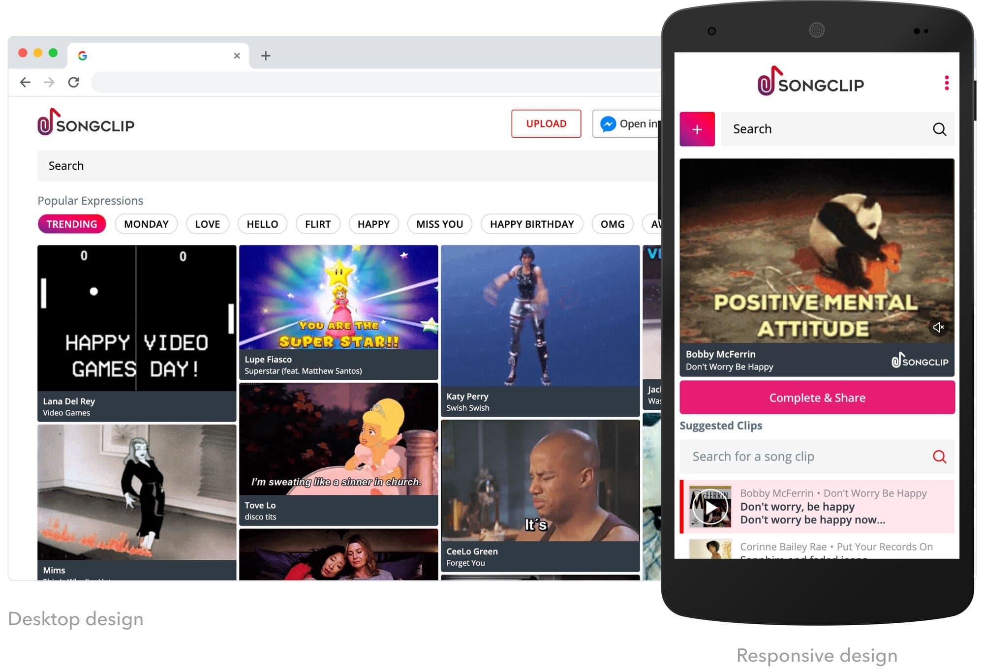
Web App Design
In order to reach non-iOS users, I also designed a Progressive Web Application suitable for users on desktop and mobile.
Third-Party Integrations
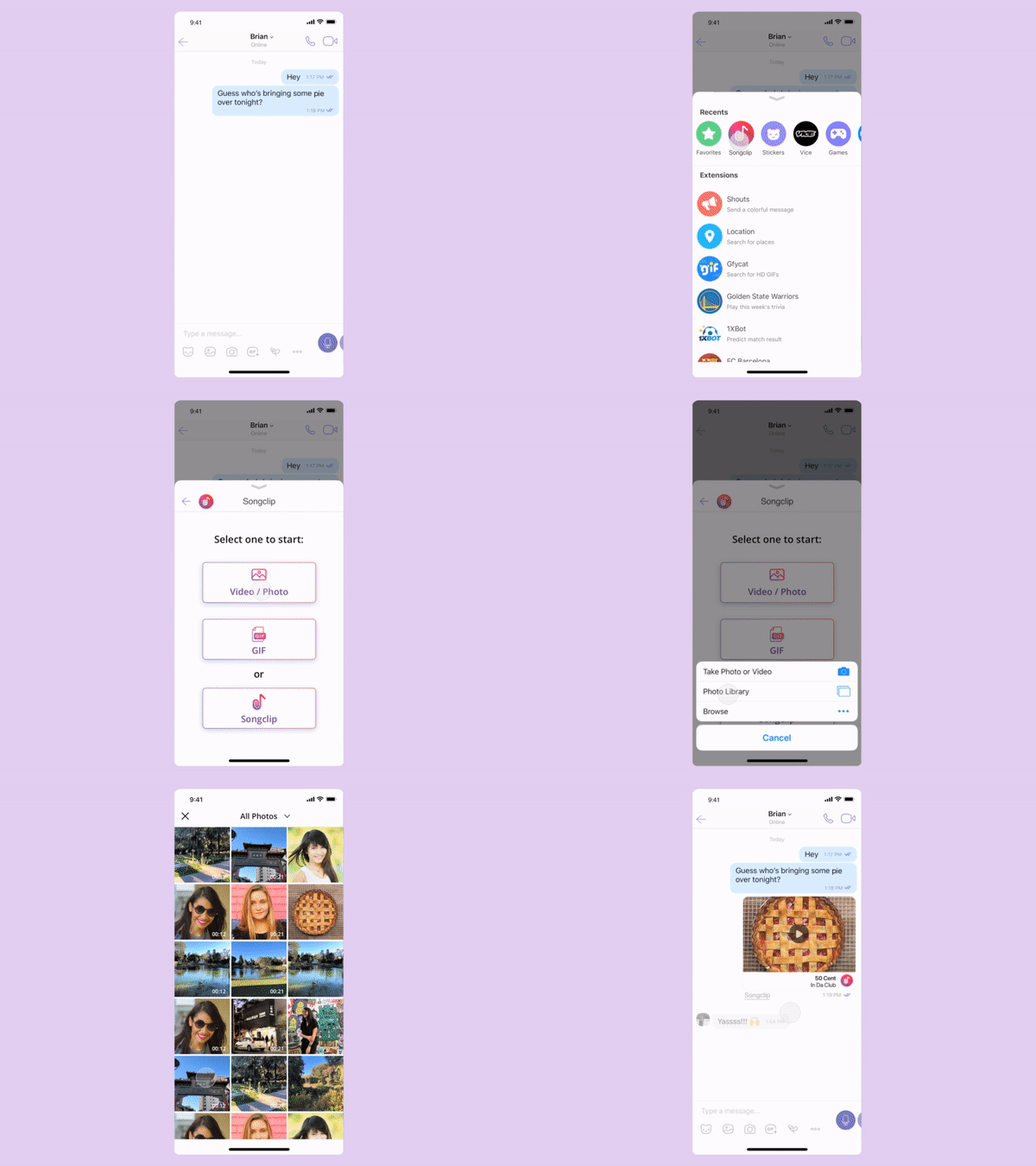
I designed the clip-discovery and sharing experience for Songclip's Viber integration. As the company's sole designer, I defined how users opened the library from a conversation, searched or browsed for a clip, previewed it and inserted it into a message. I worked directly with product, engineering and Viber's partner team to adapt Songclip's core interaction patterns to the messaging environment.

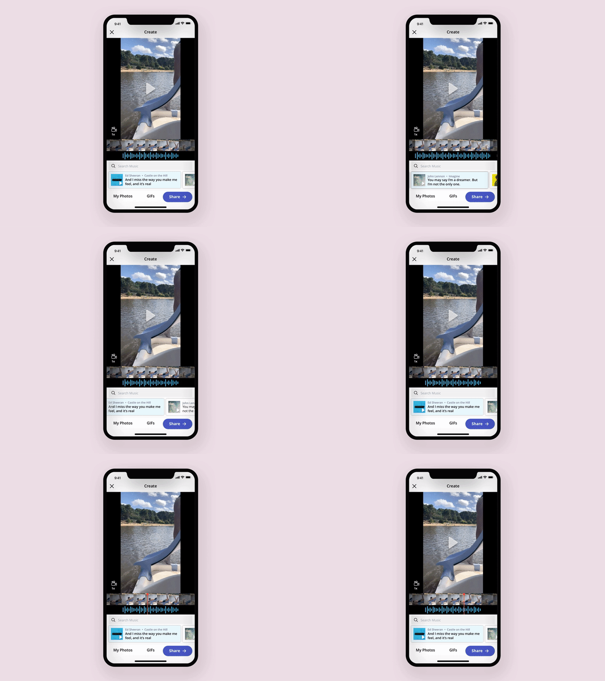
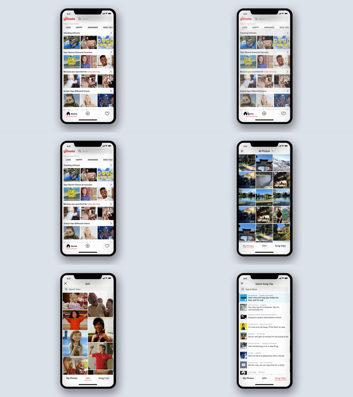
Animations and Interactions
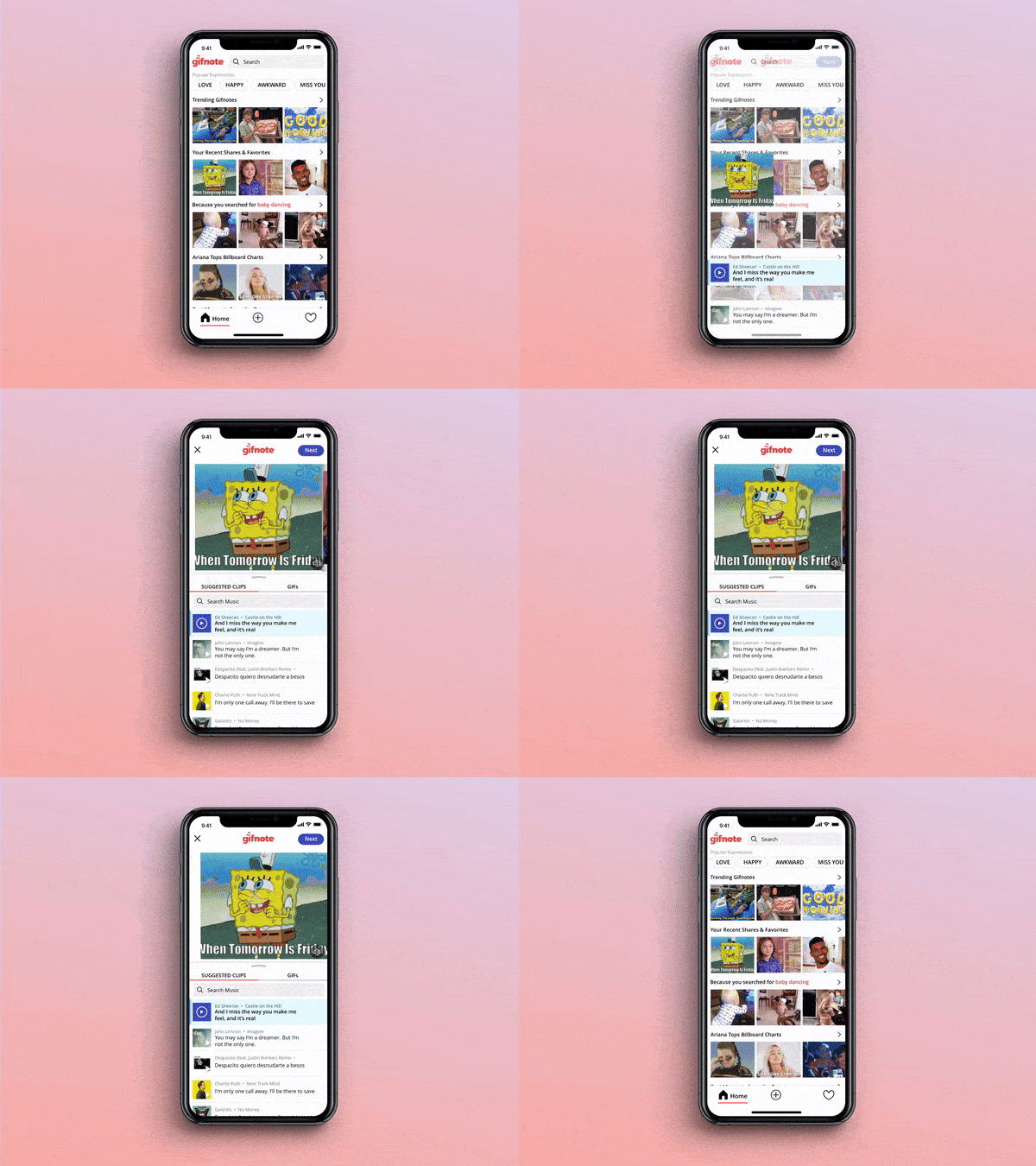
Subtle interaction details helped users understand what was playing, where they were in the flow and what would happen next.
Featured
The iOS app was featured in the App Store.
21%
Median task time reduced, measured in comparative usability testing.
What I learned from this project
What worked
Treating known-item search and exploratory discovery as separate behaviours helped us support both without compromising either experience.
What I’d do differently
I would involve partner engineering teams earlier to understand platform constraints before finalising the integration experience.
