
The problem
Spoked had a basic web app built with Bootstrap. It worked, but it wasn't reaching the users they wanted. The company wanted to attract beginner cyclists, not just professionals. Early testing showed that newcomers found the interface too complicated and quit within days. The challenge: build a mobile app that welcomes beginners without removing features that experienced cyclists loved.
User research
I ran research sessions to observe how users interact with the current product and how it fits into their training and daily routines. From this study I discovered:
Users wanted personalised training plans based on their individual goals.
Users sometimes stopped using the app when injured or on holiday.
Different user groups had varied training goals and needs.
User personas
Alex Chen
Beginner Cyclist
“I want to get fit, but the app's complexity overwhelms me.”
Recently started cycling as a fitness hobby. Works a desk job and trains 2-3 times a week. Struggles with technology and prefers simple, guided experiences.
✓Goals
- Build consistent fitness routine
- Understand proper training techniques
- Track progress without complexity
- Feel confident in the training process
✕Frustrations
- Too many confusing options in the app
- Don't know where to start or what to do
- Fear of making mistakes in training
- Overwhelming amount of settings to configure
Jordan Martinez
Advanced Cyclist
“I need detailed training analytics and control over every aspect of my workouts.”
Competitive cyclist training for races. Trained for 8+ years. Uses multiple training apps and devices. Needs advanced metrics and deep customization options.
✓Goals
- Optimize training with detailed analytics
- Manage complex training schedules
- Track performance metrics precisely
- Integrate with other training tools
✕Frustrations
- Basic app features don't meet performance needs
- Limited customization options
- Missing advanced analytics
- Can't export detailed training data
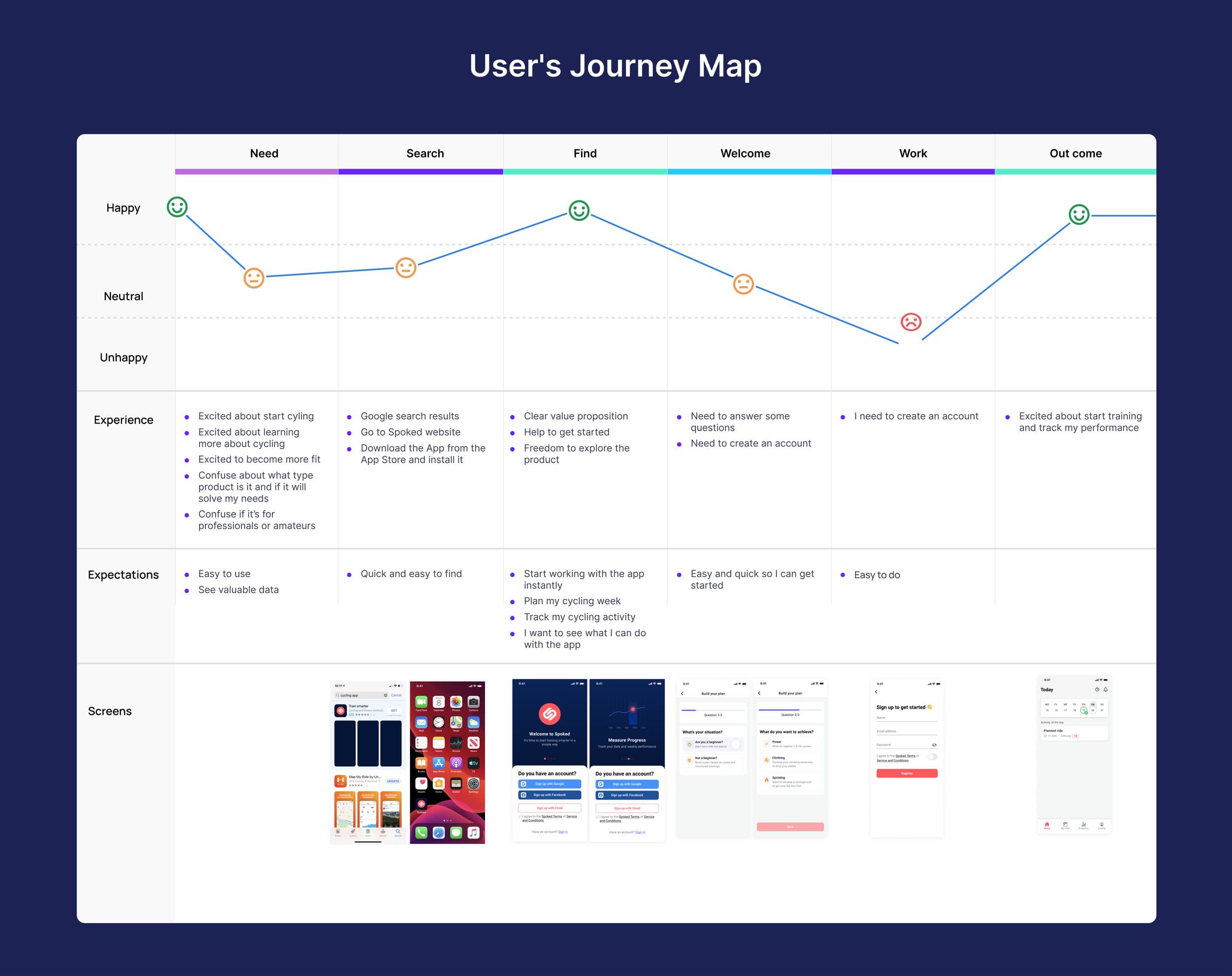
Through user testing sessions with both new and existing users, we validated the simplified interface and identified key pain points in the original design. Users appreciated the cleaner interface and found the new onboarding process much more intuitive.
The AI Behind Spoked
Spoked isn't a static training plan. It's an AI cycling coach that adapts to each user. The AI personalises training by:
Analysing ride and health data (zone data, perceived difficulty, sleep, mental and physical freshness).
Adjusting plans daily and weekly based on progress and feedback
Recalculating training load when users miss sessions or change availability.
Tracking readiness scores to tell users when to push and when to recover.
My job was to design interfaces that made this intelligence feel simple, not overwhelming.
Design decisions
Onboarding Approach
Beginners were quitting within days. The first experience had to be simple, but we still needed enough information to personalise their training plan.
I explored three approaches:
Long Form
Collect all user data upfront in one flow.
- AI gets full picture immediately
- Better personalisation from day one
- Too many questions. Users drop off before finishing.
Skip Everything
Let users explore the app first, collect data later.
- Low friction to start
- AI can't personalise without data
- Users don't know what the app can do for them
Progressive Collection
Ask only essential questions upfront. Collect more data over time through usage and prompts.
- Quick start (under 60 seconds)
- AI improves as it learns more
- Users see value before committing effort
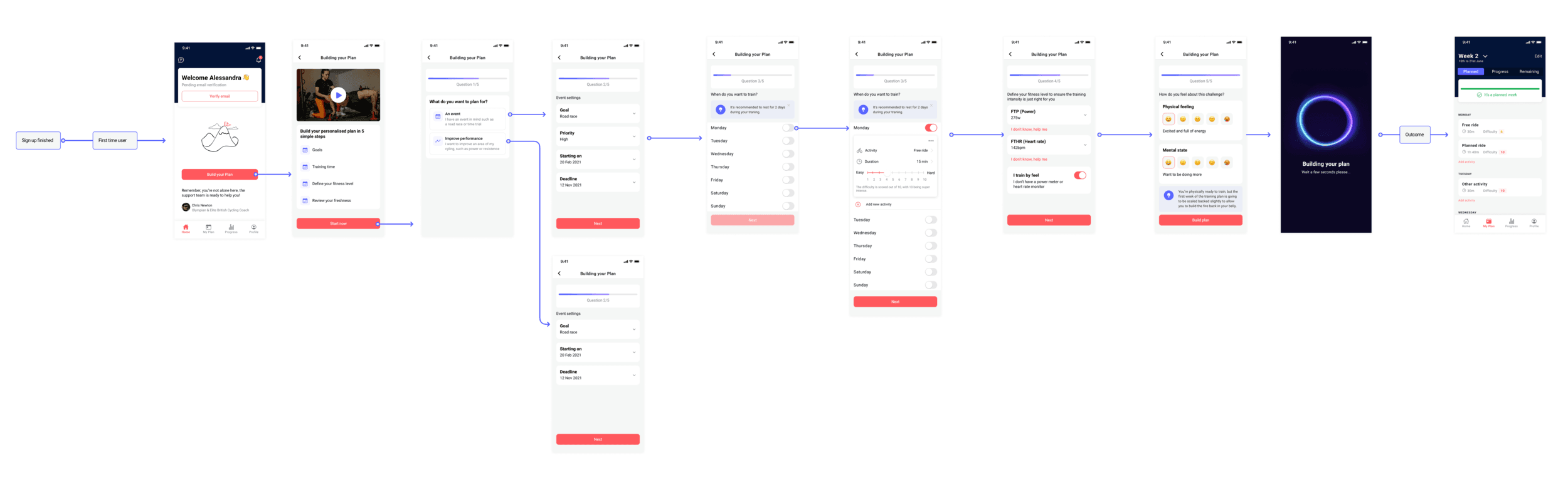
I chose progressive collection. We asked just three things upfront: goal, fitness level, and available training days. The AI started with a basic plan and refined it as users logged rides and gave feedback.
Displaying the Training Plan
The plan builder was the core of the app. Users needed to see what's coming without feeling overwhelmed.
I explored three layouts:
Calendar View
Traditional monthly/weekly calendar with sessions.
- Familiar pattern
- Hard to see workout details at a glance
- Overwhelming for beginners seeing a full month
Detailed List
Full workout breakdown with all metrics visible.
- Everything visible
- Information overload
- Intimidating for beginners
Day-by-Day Cards
Focus on today's session with easy access to the week ahead.
- One thing at a time - less overwhelming
- Clear call to action: "Here's your workout today"
- Swipe to see upcoming days
- Expandable for users who want more detail
I chose day-by-day cards. Beginners saw only what they needed: today's workout. Advanced users could expand cards to see detailed metrics and swipe through the week.
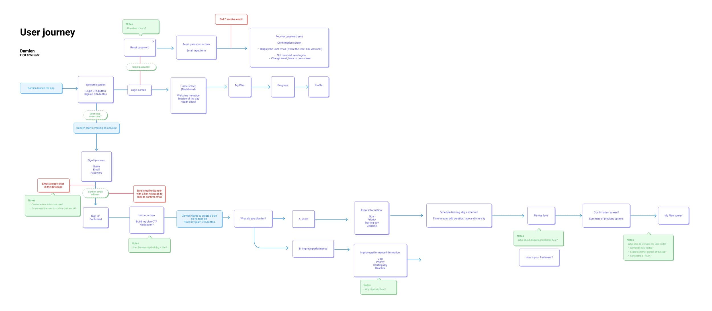
Wireframes
Hi-fidelity designs
The solution
Prototype walkthrough
Interactive prototype walkthrough demonstrating the simplified onboarding process and core user journeys that helped validate design decisions and reduce complexity for new cyclists.
Onboarding flow
The solution focused on streamlining the user journey from onboarding through daily use. I redesigned the information architecture to prioritize core features and created a progressive disclosure system that gradually introduced advanced features as users became more engaged. The new design emphasized visual feedback and achievement systems to motivate continued use.
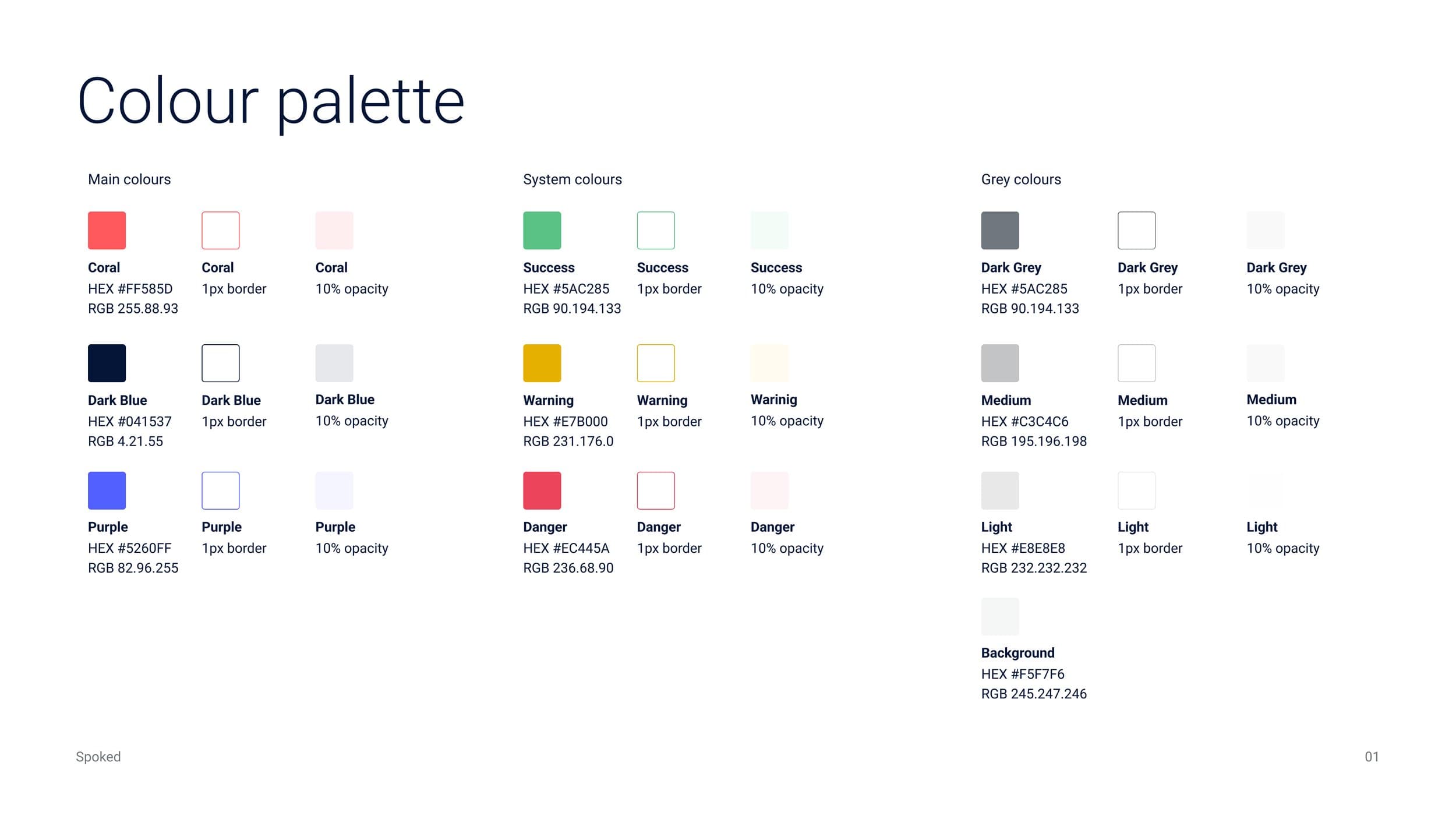
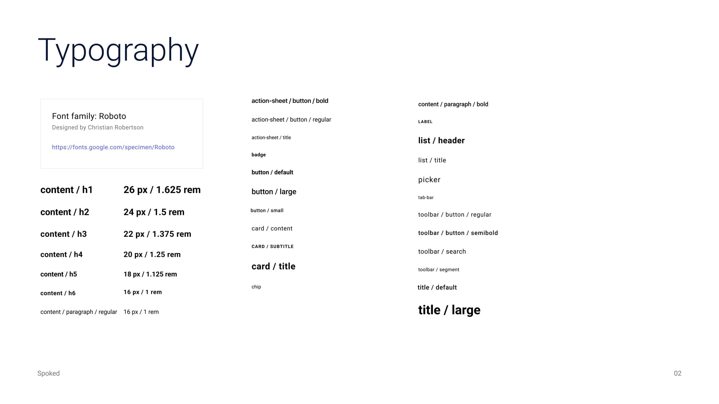
Design system
To ensure consistency and scalability across the Spoked app, I designed a comprehensive design system. This system includes a carefully curated color palette, typography hierarchy, and a library of reusable components. Typography selections were made to optimize legibility for cyclists who may be viewing the app in various lighting conditions and while in motion.
Component library
Comprehensive overview of the modular component library designed for consistency across the Spoked app, featuring cycling-optimized typography and accessibility considerations for outdoor use.
Impact
22%
New user retention increased after the mobile app launched.
Reflection
What worked
The focus on progressive disclosure and simplified onboarding resonated well with beginners while experienced users appreciated the deeper features still being available.
What I'd do differently
I would have conducted more extensive A/B testing with different onboarding flows to identify the most effective approach earlier in the process, rather than discovering it through user feedback.
