The problem
NestEgg's Broker Platform connects borrowers with credit unions, responsible community-based lenders that most people have never heard of.
I identified a 60% drop-off rate in the eligibility flow. Users would land on the homepage (nestegg.ai) and abandon the process before seeing any results. The platform didn't clearly communicate what NestEgg was, who the lenders were, or how the process worked.
Impact
10%
Drop-off rate reduced from 60% to 50% across the core loan search flow.
4
Critical user friction points identified and resolved through research.
How I approached the research
Analytics showed us the drop-off, but the numbers didn't explain why. I ran usability sessions to uncover the human behaviour behind the data. The resulting insights shaped the UX/UI redesign and shifted the product roadmap.
Analytics → Research → Insights → Design → Test → Repeat
What borrowers told us
“I always go for lenders I know. If I don't recognise the name, I'd worry it's a scam.”
Credit union member, Manchester
“I thought NestEgg was the lender. When I realised they weren't, I didn't understand who was actually giving me the loan.”
First-time borrower, Bristol
“I want to know more about who NestEgg is and how it works first.”
Self-employed borrower, London
“I don't understand why it needs my postcode. What does that have to do with a loan?”
Part-time worker, Belfast
Dots symbolise the reach of UK credit unions
What the research revealed
Lender trust
“I always go for lenders I know. If I don't recognise the name, I'd worry it's a scam.”
Credit union member, Manchester
Participants who wouldn't use a lender they didn't recognise.
Brand confusion
“I thought NestEgg was the lender. When I realised they weren't, I didn't understand who was actually giving me the loan.”
First-time borrower, Bristol
Participants who couldn't tell if NestEgg was a lender or a lender aggregator.
Missing credibility
“I want to know more about who NestEgg is and how it works first.”
Self-employed borrower, London
Participants who expected to see who NestEgg was before sharing personal information.
Unexplained questions
“I don't understand why it needs my postcode. What does that have to do with a loan?”
Part-time worker, Belfast
Participants confused by eligibility questions they didn't understand.
Improvements we focused on
In financial services, trust is the product. That principle shaped every design decision on this project. I wrote about it in Why High-Stakes UX Is a Different Discipline.
Unfamiliar lenders feel risky
Borrowers strongly preferred credit unions they were already familiar with. When presented with unrecognised lenders, they assumed no viable options were available for them and abandoned the flow.
4 out of 5 participants affectedThe broker identity gap
The homepage failed to clearly distinguish NestEgg as a broker rather than a direct lender. Users who realised this mid-flow felt deceived, highlighting a critical flaw in the information architecture.
4 out of 5 participants confusedNo credibility before the ask
Users expected to see who NestEgg was before being asked for personal information. The homepage went straight to the eligibility form without establishing trust. Every question felt like a withdrawal from a trust balance that hadn't been built yet.
5 out of 5 wanted more contextUnexplained questions erode trust
The flow requested sensitive data (postcode, employer, child benefits) without providing context. Without clear explanations, users viewed the questions as invasive and abandoned the flow.
3 out of 5 would abandon flowDesign decisions
We explored several approaches to rebuild trust in the eligibility flow. We narrowed it down to these three.
Add an explainer modal
A popup on first visit explaining what NestEgg is and how the process works.
- Low development effort. Addresses the comprehension gap.
- Modals are routinely dismissed without reading. Doesn't solve the problem at the point of confusion.
Redesign the homepage only
Add a clear value proposition and who we are section to the homepage before the CTA.
- Sets expectations before the flow begins.
- Doesn't help users who arrive via a credit union-branded link or ad. Doesn't address in-flow confusion.
Progressive trust-building throughout the flow
Redesign the homepage, inject contextual explanations into every eligibility question, and introduce credit union-branded landing pages to maintain familiarity.
- Addresses trust deficits at every touchpoint. Highly resilient to different traffic sources.
- Highest development effort. Required a phased rollout strategy to manage scope.
I pushed for progressive trust-building because a single explainer modal on the homepage is useless if a user encounters an invasive question five steps later. In financial UX, trust must be continuously earned and maintained at every interaction.
The solution: a two-sided approach to trust
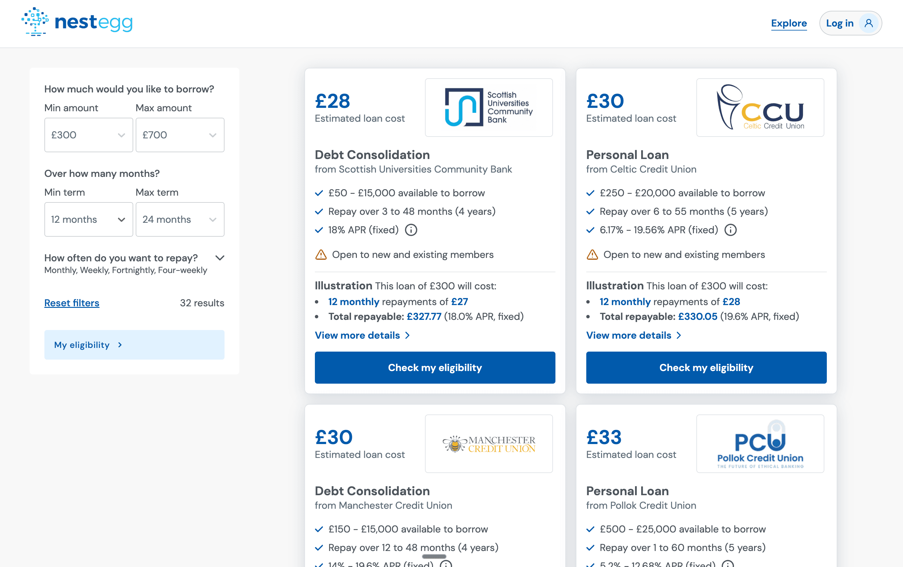
The research showed borrowers trusted lenders they already knew. So we designed a system where credit unions could present their own brand directly to borrowers, and that branding flows through into the loan search experience.
Lender trust
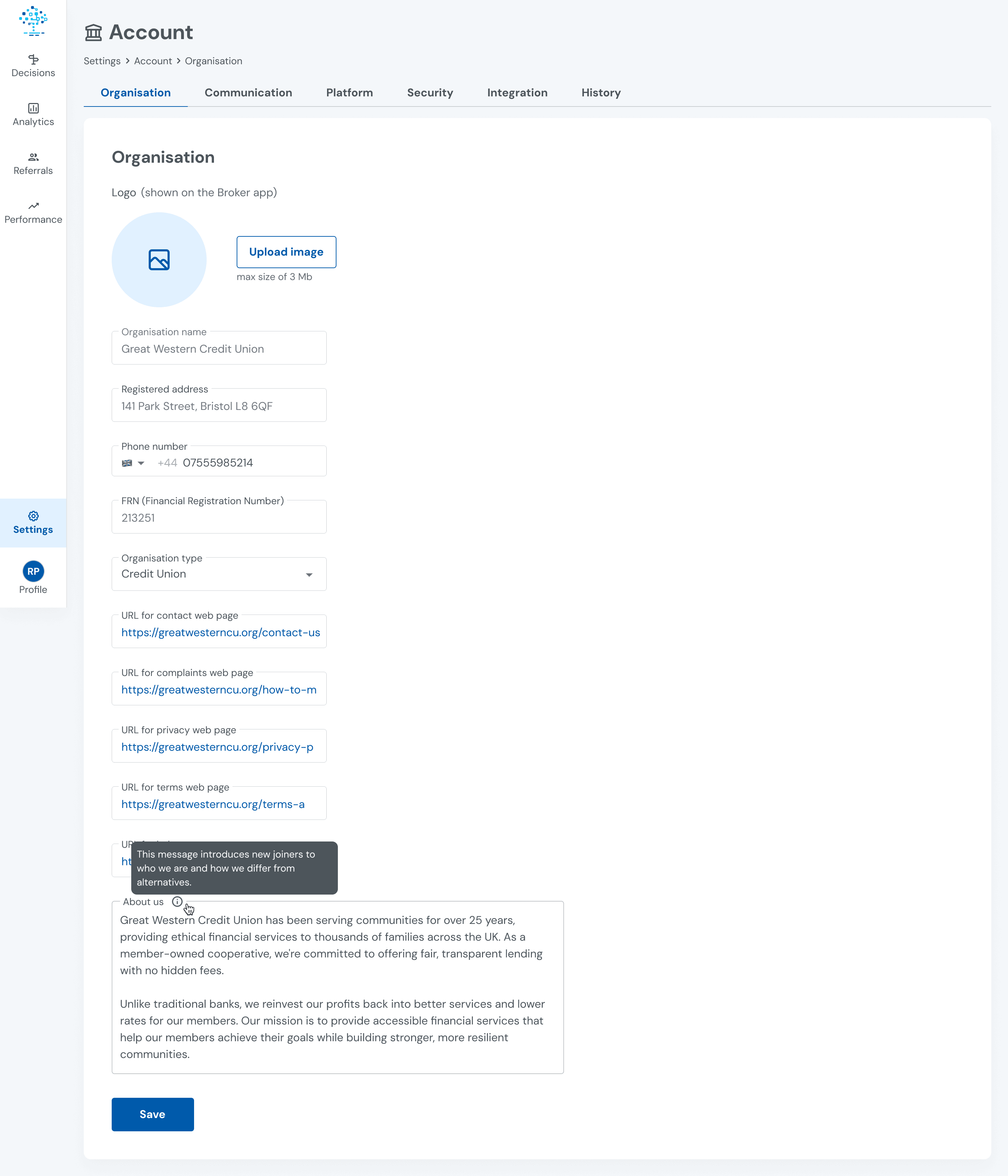
Instead of asking borrowers to trust an unknown name, we let credit unions tell their own story. Each lender can upload their logo, write an about section, and add details about their loan products. When a borrower clicks on a loan card, they see the credit union's branding, their story, and the loan details.
Logo upload so borrowers see a familiar brand, not an unknown name.
About Us section lets credit unions tell their story and build credibility.
Organisation details establish legitimacy before borrowers are asked for personal information.
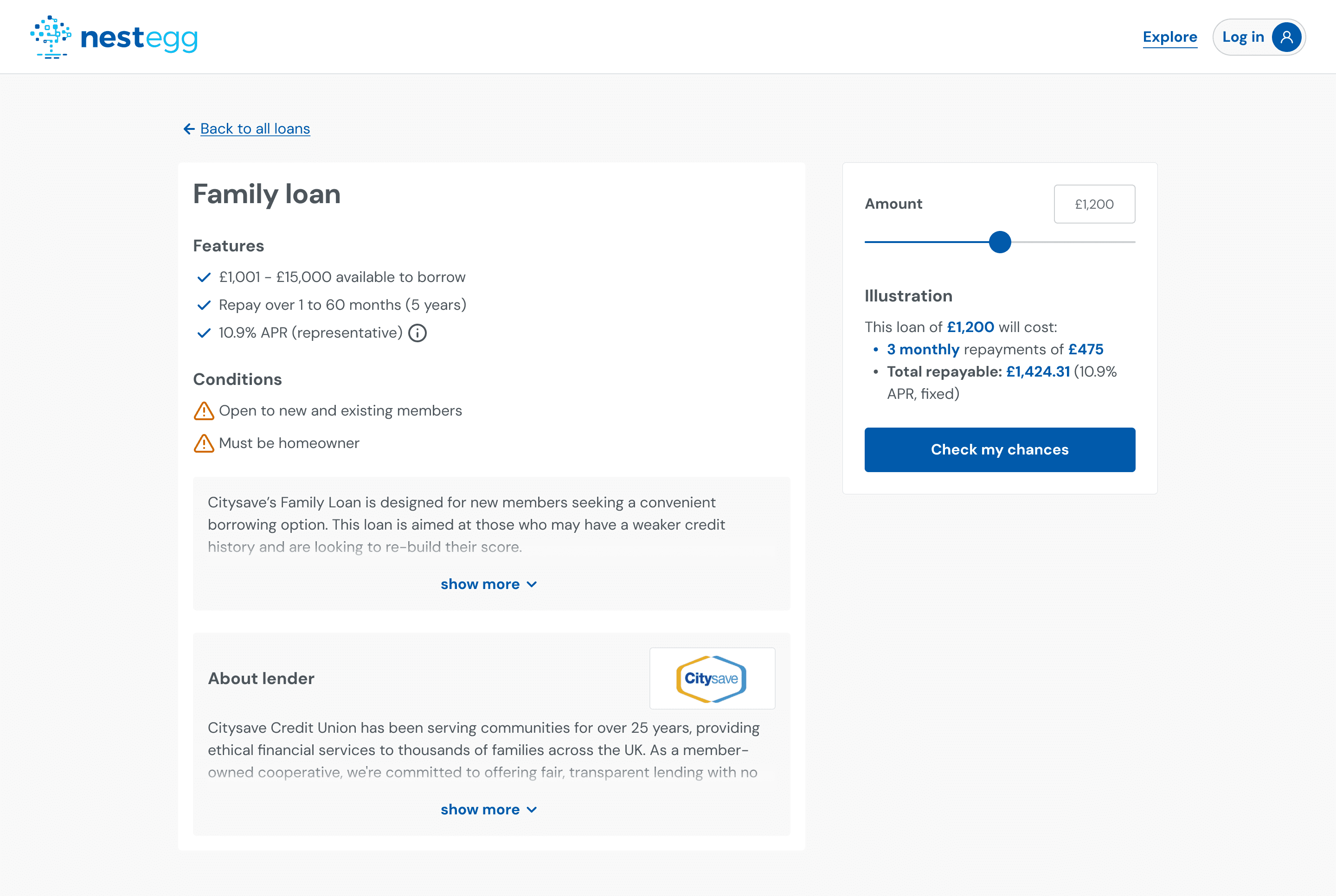
Credit union logo and name visible immediately. Populated directly from the B2B dashboard.
About lender section uses the credit union's own words, not generic broker copy.
Loan details and conditions shown upfront, no hidden surprises mid-flow.
Clarifying the broker identity
To close the broker identity gap, we restructured the homepage. Instead of pushing users straight into the eligibility form, we explained what NestEgg is (a broker, not a lender) before the main CTA. FCA regulation badges and an FAQ section sit above the fold so users get answers before they're asked for information.
Clear value proposition explaining NestEgg is a broker, not a lender.
FCA regulation badges to establish credibility above the fold.
FAQ section answering common questions before borrowers enter the flow.
Contextualising sensitive data
Eligibility questions like postcode, employer, and child benefits confused borrowers who didn't understand why they were being asked. We added contextual help text beneath each question explaining why it's asked and how it affects results. We also replaced the long scrolling employer list with a type-ahead search.
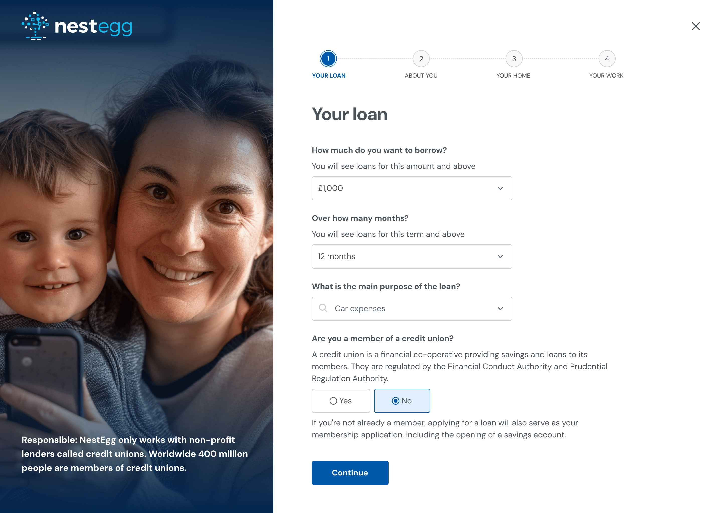
Help text beneath each question explains why it's asked, addressing the 'unexplained questions' finding.
Credit union membership question includes a plain-language explanation of what a credit union is.
Clear step indicator so borrowers know where they are in the flow and what comes next.
Design system
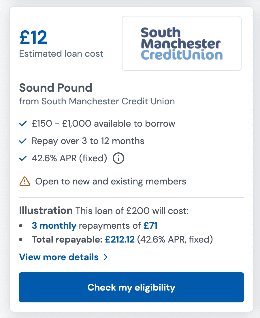
Loan Product Card
A credit union loan offer, co-branded with the lender.
- FCA compliance built-in: the representative example sits inside the card without breaking visual hierarchy.
- Trust through co-branding: the credit union's logo establishes local credibility before the borrower reads a word.
- Progressive disclosure: full terms sit behind 'View more details' to reduce cognitive load while keeping transparency one tap away.
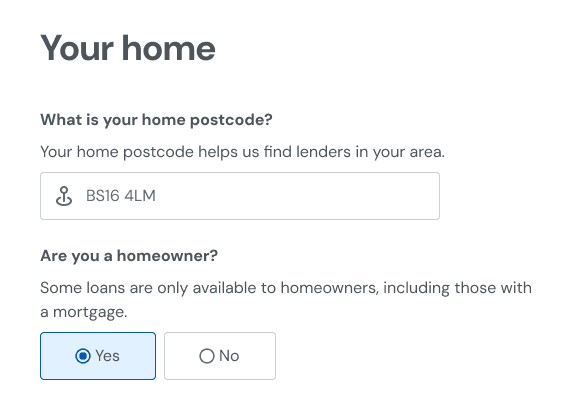
Eligibility Question with Help Text
A form field that explains why each question is asked.
- Inline help text: answers 'why are you asking this?' before the borrower has to wonder.
- Trust-first phrasing: no hidden reasons, no surprises.
- Mobile-first inputs: simple patterns (text, Yes/No) keep the flow fast.
Strategic impact: shaping the future
Beyond the eligibility flow redesign, the research surfaced an insight about NestEgg's product positioning: the platform was designed for people who already understood credit unions, but its growth depended on reaching people who had never heard of one.
The platform was built for people who already knew what credit unions were and actively sought them out.
Growth depends on reaching people who have never heard of a credit union. The platform needed to meet them where they are.
Invested in credit union-branded landing pages. Borrowers now arrive via a brand they already trust, like their local fire service or employer's credit union. NestEgg powers the experience behind the scenes.
Reflection
What worked
Running usability sessions with borrowers, not internal stakeholders, gave us quotes and behaviours that were impossible to argue with. When I showed the team a recording of a user abandoning the flow because of the invasive child benefits question, the need for contextual help text became undeniable. Recording and sharing user sessions is the most effective way to build shared understanding in a small team.
What I'd do differently
I would have pushed for a second round of testing after the homepage shipped. Our prototypes gave strong signals. A quick follow-up with 5 participants would have confirmed whether first-time visitors understood NestEgg's role before starting the flow.


